Color psychology in web design influences how visitors feel about and interact with your site. Red creates urgency for CTAs, blue builds trust for financial platforms, and yellow captures attention but shouldn’t be overused. Different cultures interpret colors uniquely—white symbolizes mourning in Eastern cultures but purity in Western contexts. When selecting your color scheme, consider both emotional impact and accessibility, as 8% of men have color vision deficiencies. The right palette can boost conversions by up to 15%.
The Science Behind Colour Perception and Emotional Response

While science attempts to explain how our brains process colors, the reality is that our understanding of color perception remains largely subjective and culturally influenced.
You’ll find that colour theory provides a framework for understanding these responses, but it can’t predict exactly how your website visitors will react to specific hues.
When designing your website, you’re actually crafting an emotional resonance through your colour choices.
Blues might convey trustworthiness for many Western users, while red signifies luck and prosperity in Chinese culture. This cultural variability makes colour psychology both fascinating and complex.
You shouldn’t rely solely on generalizations about colour meanings.
Instead, consider your specific audience‘s cultural background and expectations.
Test your colour schemes with actual users to validate their effectiveness rather than assuming universal emotional responses.
Primary Colours and Their Psychological Impact on Users
Since our brains process different wavelengths as distinct emotional triggers, primary colours serve as fundamental building blocks in establishing your website’s psychological framework.
Red evokes urgency and passion, potentially increasing conversion rates when used for call-to-action buttons. Blue, conversely, builds trust and security—making it ideal for financial or healthcare platforms seeking to convey reliability.
Strategic color selection transforms passive visitors into active participants—red demands immediate action while blue nurtures long-term trust relationships.
Yellow captures attention and optimism but requires careful implementation to avoid visual fatigue.
When selecting your colour palette, you’re not merely making aesthetic choices; you’re crafting deliberate psychological cues that drive user engagement. Current colour trends favor strategic combinations rather than isolated primaries, allowing you to create nuanced emotional environments that guide visitors through your digital space.
Remember that cultural context greatly influences colour interpretation, necessitating research before finalizing your design decisions.
Cultural Variations in Colour Interpretation
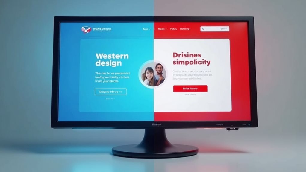
When designing websites for global audiences, you’ll need to contemplate that colours carry vastly different meanings across Eastern and Western cultures.
In East Asian countries, white often symbolizes mourning and death, while Western cultures typically associate it with purity and weddings.
Your colour choices might resonate perfectly with one demographic but potentially alienate another, making cultural research a crucial component of your design process rather than an afterthought.
East vs. West
Despite sharing the same visual spectrum, Eastern and Western cultures often interpret colours through dramatically different cultural lenses. When designing for global audiences, you’ll need to steer through these cultural contrasts carefully.
For instance, while white symbolizes purity and weddings in Western contexts, it’s associated with mourning and funerals in many Eastern traditions.
Red illustrates these regional preferences perfectly—representing danger or passion in the West but symbolizing good fortune and celebration in China.
Similarly, purple conveys royalty and luxury to Western audiences but has spiritual or mourning associations in some Eastern cultures.
You’ll achieve more effective cross-cultural design by acknowledging these differences.
Consider creating alternative color schemes for different markets rather than assuming universal interpretations, especially when targeting specific regional audiences.
Symbolism Across Continents
Beyond the East-West divide, colour symbolism varies dramatically across individual continents and countries, creating a complex global tapestry of interpretations.
When designing for international audiences, you’ll need to research specific cultural associations rather than relying on broad generalizations.
In Africa, vibrant reds and earthy tones often represent heritage and community, while Nordic countries accept minimalist blue-grey palettes reflecting their natural environments.
These regional colour trends can greatly influence how your website resonates with local users.
The challenge isn’t about finding “safe” global palettes but understanding the nuanced messages your colour choices communicate.
What works beautifully in Brazil might confuse users in Morocco.
Strategic Colour Selection for Different Industry Websites
When selecting colours for your industry’s website, you’ll need to contemplate both established sector conventions and your target audience’s emotional responses.
Healthcare sites often utilize calming blues to inspire trust, while retail platforms leverage vibrant reds and oranges to stimulate purchasing decisions.
You can strategically combine primary brand colours with complementary accents to create a palette that not just aligns with your industry’s expectations but also triggers the specific emotional responses you’re aiming to evoke from visitors.
Industry-Specific Colour Palettes
Although colour psychology applies universally, different industries have developed strategic colour palettes that align with their specific goals and audience expectations.
When you’re designing a website, understanding these industry norms can strengthen your brand identity while creating a familiar user experience that visitors instinctively trust.
- Healthcare – Blues and greens dominate this sector, conveying cleanliness, calm, and professionalism while avoiding aggressive reds that might suggest blood or pain.
- Financial services – Deep blues and greens project stability, security, and growth, with occasional gold accents to suggest prosperity.
- Technology – Blues, whites, and sleek greys create a forward-thinking, clean aesthetic that balances innovation with reliability, while startups often incorporate vibrant accent colours to differentiate themselves.
Emotional Targeting Techniques
Successful designers don’t just select colours based on personal preference; they strategically target specific emotional responses from their audience. By understanding the emotional resonance certain colours create, you’ll craft more effective websites that connect with visitors on a psychological level.
When designing for different industries, consider how colour associations vary by context. Financial sites benefit from blues and greens that convey trust and stability, while restaurants might leverage warm reds and oranges to stimulate appetite. Tech companies often employ cool blues and purples to suggest innovation.
The key is alignment between your colour choices and the emotional state you want to evoke. Test your palette with actual users to validate your assumptions, as cultural differences can greatly impact colour perception.
This targeted approach guarantees your design speaks directly to your audience’s emotional needs.
Colour Harmony Principles That Drive Conversion
Despite what many designers believe, colour harmony isn’t just about aesthetics—it’s a powerful conversion tool that directly impacts your visitors’ purchasing decisions. When you apply colour theory strategically, you establish a visual hierarchy that guides users through your conversion funnel naturally.
Colour harmony creates intuitive pathways that guide users to conversion, not just visual pleasure.
- Complementary contrasts create focal points that draw attention to CTAs, increasing click-through rates by up to 15% when properly implemented.
- Analogous schemes reduce cognitive load, making product information easier to process and creating a sense of cohesiveness.
- Triadic harmony strikes the perfect balance between visual interest and organization, particularly effective for showcasing product categories.
You’ll find that balanced colour relationships don’t just make your site look better—they actively shape user behavior and establish trust through professional visual coherence.
Accessibility Considerations in Colour Psychology
Why do many designers overlook accessibility when implementing colour psychology principles? Often, they’re so focused on emotional impact and conversion optimization that they forget that not everyone perceives colours the same way. About 8% of men and 0.5% of women experience some form of color vision deficiency, making certain colour combinations indistinguishable.
You’ll need to balance aesthetic choices with functional requirements by implementing appropriate contrast ratios. The WCAG recommends a minimum contrast ratio of 4.5:1 for normal text and 3:1 for large text. This guarantees your content remains accessible without sacrificing psychological impact.
Consider using tools like colour blindness simulators to test your designs. When you prioritize accessibility in your colour psychology strategy, you’re not simply complying with standards—you’re expanding your reach to include all potential users.
Final Thoughts
You’ve now scratched the surface of colour psychology in web design. When you’re planning your next website, remember that colours aren’t just window dressing—they’re powerful communication tools that speak volumes before visitors read a single word. By balancing aesthetic appeal with psychological impact and accessibility, you’ll create designs that don’t just look good but genuinely connect with users across cultural boundaries. The ball is in your court to implement these principles thoughtfully.
Business Consultant at iindigo
I help business owners build their online brand to help attract more clients and grow their business.
Latest posts by Mark Draper (see all)
- How to Track and Improve Website Conversion Rates - 14/01/2026
- Best Practices for Call-to-Action Buttons - 09/01/2026
- The Psychology of Colours in Web Design - 04/01/2026