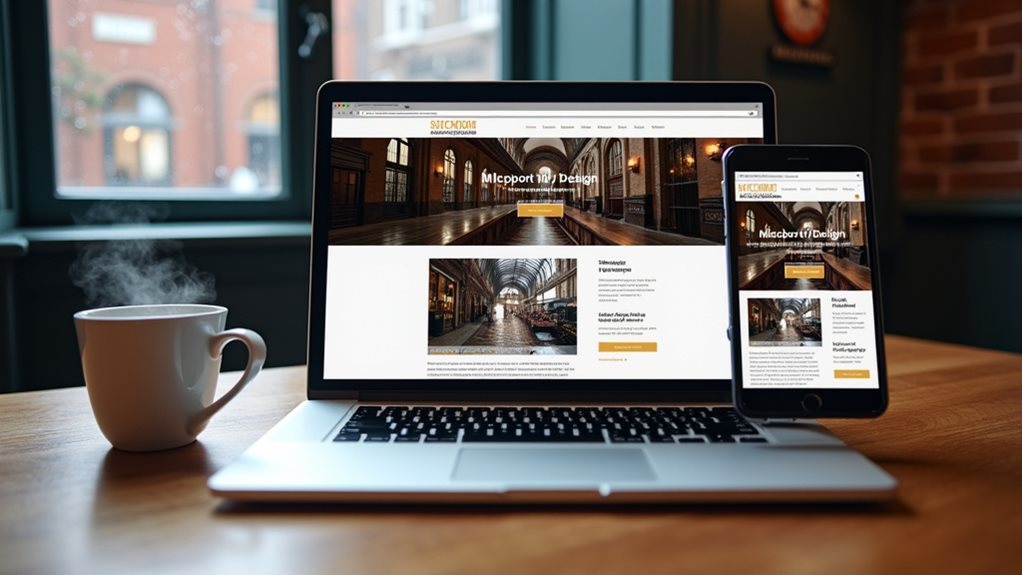
You’ll dramatically improve your Stockport website’s responsiveness by adopting mobile-first design principles that prioritize smaller screens before scaling up. Focus on optimizing images through compression techniques, converting PNGs to JPEGs, and implementing WebP formats for faster loading times. Use flexible CSS Grid and Flexbox systems with strategic media queries to guarantee seamless adaptation across all devices. Test thoroughly on various smartphones, tablets, and browsers while leveraging local Stockport web development resources to discover advanced optimization strategies.
Understanding Mobile-First Design Principles for Stockport Businesses

Since mobile devices now account for over half of all web traffic, Stockport businesses can’t afford to ignore mobile-first design principles when building their websites.
You’ll need to prioritize smaller screens first, then scale up to desktop versions. This approach guarantees your site’s user experience remains seamless across all devices.
Start by designing for the smallest screen size, focusing on vital content and navigation.
You’ll want to maintain design consistency throughout your responsive breakpoints, making sure your brand identity stays strong whether customers view your site on phones, tablets, or computers.
Consider touch-friendly button sizes, readable fonts, and fast-loading images that won’t frustrate mobile users.
Optimizing Images and Media Files for Faster Loading Times
While your mobile-first design creates the foundation for responsive websites, heavy images and media files can quickly sabotage your loading speeds and frustrate visitors before they even see your content.
You’ll need to master image compression techniques to reduce file sizes without sacrificing visual quality. Start by converting large PNG files to JPEG format for photographs, while keeping PNG for graphics with transparency. Consider using WebP format, which offers superior compression compared to traditional formats.
Don’t overlook your media file formats either. Replace heavy GIFs with lightweight MP4 videos, and guarantee you’re serving appropriately sized images for different screen resolutions.
Implement lazy loading to defer off-screen content, and compress videos before uploading. These optimization strategies will dramatically improve your site’s performance across all devices.
Implementing Flexible Grid Systems and CSS Media Queries

After optimizing your media files, you’ll discover that flexible grid systems form the backbone of truly responsive web design, allowing your content to adapt seamlessly across every device imaginable.
CSS Grid and Flexbox aren’t just trendy tools—they’re crucial for creating flexible layouts that automatically adjust to different screen sizes. You’ll want to implement CSS media queries alongside these systems, defining specific breakpoints where your design shifts to accommodate tablets, smartphones, and desktop computers.
Start with a mobile-first approach, then scale upward using media queries like `@media (min-width: 768px)`. This strategy guarantees your responsive design works flawlessly across all devices.
Testing Website Performance Across Multiple Devices and Browsers
Building flexible grid systems and implementing media queries represents just the foundation of responsive design—the real test comes when you evaluate how your website actually performs across the diverse terrain of devices and browsers your users employ.
True responsive design isn’t about perfect code—it’s about flawless performance across every device your users actually own.
You’ll need to conduct thorough device specific testing across smartphones, tablets, and desktops with varying screen sizes. Don’t just test on your favorite devices—consider older models and different operating systems your audience might use.
Cross browser compatibility remains essential, as Safari, Chrome, Firefox, and Edge can render elements differently.
Use browser developer tools to simulate various viewports, but complement this with real device testing. Performance metrics like loading speed, touch responsiveness, and visual consistency matter greatly.
Document any inconsistencies you discover and prioritize fixes based on your audience’s most common device and browser combinations.
Leveraging Local Stockport Web Development Resources and Tools

Three powerful advantages emerge when you tap into Stockport’s thriving web development ecosystem: access to specialized local talent, cost-effective collaboration opportunities, and tools specifically designed for the UK market.
Working with nearby developers means faster communication, shared understanding of local business needs, and easier face-to-face meetings. You’ll benefit from their expertise in optimizing local SEO strategies that connect with Greater Manchester audiences while guaranteeing exceptional user experience across all devices.
Consider these crucial local resources:
- Stockport Digital Hub – Networking events and collaborative workspaces for tech professionals
- Manchester Web Development Meetups – Monthly gatherings sharing latest responsive design techniques
- Local WordPress User Groups – Hands-on workshops for content management optimization
These connections provide ongoing support, keeping your website current with evolving responsive design standards while building valuable professional relationships within your community.
Frequently Asked Questions
What Are the Typical Costs for Website Responsiveness Improvements in Stockport?
You’ll find website responsiveness improvement costs vary greatly based on several cost factors including site complexity, design requirements, and functionality needs. A local agency in Stockport typically charges £500-£3,000 for thorough responsive redesigns.
How Long Does It Take to Make a Website Fully Responsive?
You’ll typically need 2-4 weeks for complete website design overhaul and mobile optimization. Timeline depends on your site’s complexity, content volume, and desired features. Simple sites transform faster, while complex e-commerce platforms require extended development periods.
Can I Improve Responsiveness Without Completely Redesigning My Existing Website?
You can definitely boost responsiveness through strategic website tweaks rather than a complete overhaul. Focus on mobile optimization adjustments like flexible grids, scalable images, and updated CSS media queries to improve your site’s performance.
Which Stockport Businesses Have Successfully Improved Their Website Responsiveness Recently?
You’ll find several Stockport cafes like The Pantry and local retailers such as independent bookshops have recently upgraded their mobile sites. They’ve improved loading speeds and navigation without full redesigns, making customer browsing much more seamless.
Do Responsive Websites Actually Increase Sales for Stockport Local Businesses?
Yes, you’ll see higher conversion rates when you implement mobile optimization. Your responsive website captures more mobile shoppers who’d otherwise abandon slow-loading sites. Better user experience directly translates to increased sales and customer retention.
Final Thoughts
You’ve now got the crucial toolkit for transforming your Stockport business website into a responsive powerhouse. By embracing mobile-first design, optimizing your media files, implementing flexible grids, and thoroughly testing across devices, you’ll create an experience that truly serves your local customers. Don’t forget to tap into Stockport’s web development community for ongoing support. Start implementing these strategies today, and you’ll see improved user engagement and better search rankings tomorrow.

Business Consultant at iindigo
I help business owners build their online brand to help attract more clients and grow their business.
Latest posts by Mark Draper (see all)
- How to Track and Improve Website Conversion Rates - 14/01/2026
- Best Practices for Call-to-Action Buttons - 09/01/2026
- The Psychology of Colours in Web Design - 04/01/2026