Choose brand colours that trigger the right emotional response in your audience—blue for trust, red for excitement—while guaranteeing they align with your values. Limit your palette to 3-5 complementary colours and select 2-3 typefaces that reflect your personality (serif for tradition, sans-serif for modernity). Study competitors to find visual gaps you can fill, then test your selections across multiple platforms for consistency and legibility. The perfect combination will build recognition and strengthen your brand’s connection with customers.
Understanding the Psychology Behind Brand Colours
When you’re developing a brand identity, the colours you choose speak volumes before a single word is read. Your palette creates immediate emotional associations that influence how customers perceive your business.
Blue evokes trust and reliability, making it perfect for financial institutions, while red triggers excitement and urgency, explaining why it’s favored by fast-food chains.
Understanding color symbolism helps you align your visual presence with your brand values. Yellow communicates optimism and affordability, green suggests growth and health, and purple conveys luxury and creativity.
Colors aren’t just visual choices—they’re silent messengers that tell your brand story before words ever do.
Consider how these psychological connections might strengthen—or contradict—your brand message.
Don’t select colors solely based on personal preference; instead, research your industry standards, competitor palettes, and target audience preferences.
The right combination will resonate with your ideal customers and differentiate you in your market.
Developing a Strategic Colour Palette That Reflects Your Values
Creating your brand’s colour palette isn’t just about aesthetics—it’s about translating your core values into visual language that resonates with your audience.
You’ll want to build upon your understanding of colour psychology by selecting primary, secondary, and accent colours that work harmoniously while reinforcing your brand’s personality and message.
Your palette creation process should include experimentation with different combinations, testing them across various applications, and collecting feedback to ascertain they evoke the intended emotional response from your target market.
Psychology of Colour
The psychology of colour operates as a silent language that communicates your brand’s personality before a single word is read. When selecting your palette, consider the emotional associations each hue evokes in your target audience.
Blue conveys trust and reliability, while red triggers excitement and urgency—crucial distinctions when positioning your business.
Color symbolism varies across cultures, so research your market thoroughly before committing. Yellow might represent optimism in Western contexts but signify jealousy elsewhere.
You’ll want to balance your instinctive preferences with strategic choices that align with your brand values. Consider how competitors use colour and whether you should conform to industry standards or deliberately stand apart.
Palette Creation Process
Developing a strategic colour palette begins with deep introspection about your brand’s core values and personality traits. Ask yourself: What emotions should your brand evoke? Are you conveying trust, excitement, or sophistication? Your answers will guide your primary colour selections.
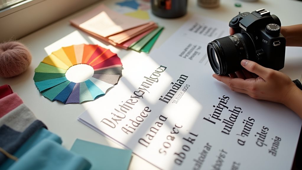
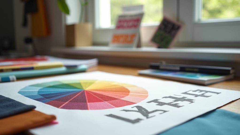
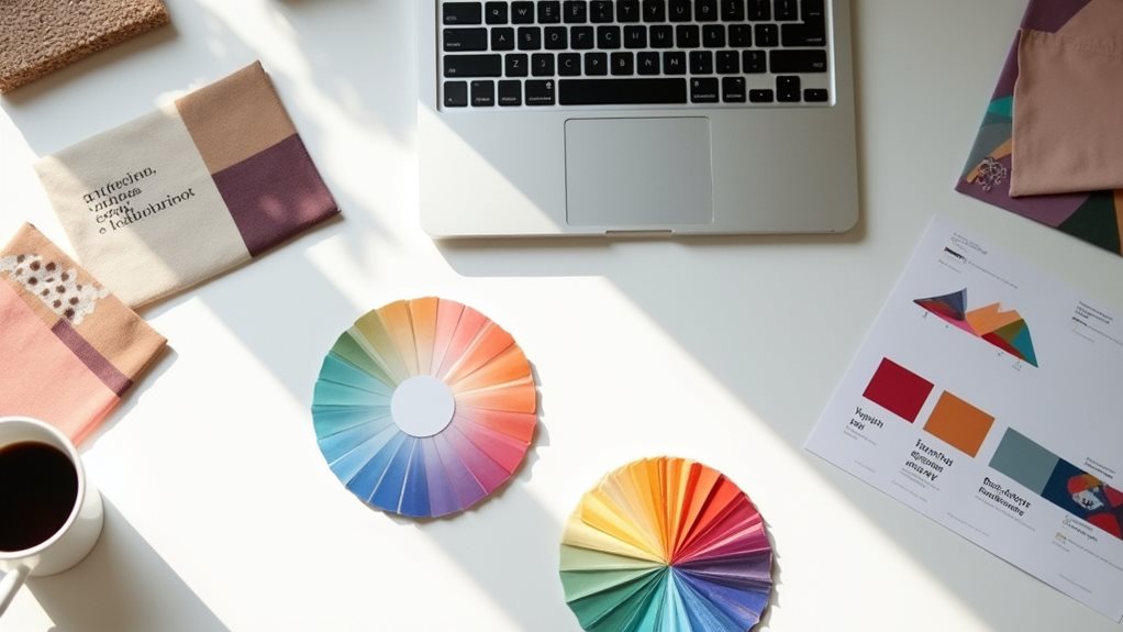
Next, apply principles of color harmony to expand your palette. Choose complementary or analogous colours that work together while maintaining your brand’s emotional impact. Limit yourself to 3-5 core colours to prevent visual confusion.
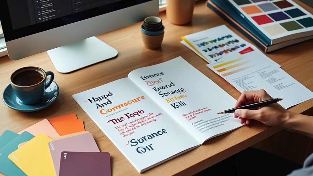
Don’t forget that your palette must work alongside your font pairing choices. Your typography and colours should tell the same story—a playful brand might use vibrant hues with rounded fonts, while a luxury brand might employ deep tones with elegant serifs.
Test your palette across different applications to guarantee versatility before finalizing your selection.
Typography Fundamentals: Choosing Fonts That Speak Your Brand Language
Selecting the right typography for your brand isn’t just about picking fonts that look nice—it’s about choosing visual voices that communicate your brand’s personality even before words are read.
When crafting your typographic identity, consider both font pairing and type hierarchy to create a cohesive system that directs your audience’s attention.
Start by identifying fonts that align with your brand values—serif fonts often convey tradition and reliability, while sans-serif options suggest modernity and approachability.
Fonts speak before words do—choose serifs for heritage, sans-serifs for contemporary connection.
Limit your selection to 2-3 typefaces to maintain consistency across materials.
Remember that effective type hierarchy establishes relationships between elements, helping readers traverse your content intuitively.
Test your choices across different applications to verify they’re versatile enough for all your brand touchpoints.
Analyzing Your Industry and Competitors’ Visual Identities
Before selecting your brand colors and fonts, you’ll need to analyze the visual conventions within your industry—like the blues common in finance or greens in eco-friendly businesses—to understand established visual language.
You can create a visual competitor map to identify patterns and opportunities for differentiation through your typography choices, noting where serif fonts might signal tradition or sans-serif might suggest innovation.
Your ultimate goal isn’t to mimic competitors but rather to understand the visual environment well enough to carve out a distinctive identity that both respects industry norms and highlights what makes your brand uniquely compelling.
Industry Color Conventions
When you’re establishing your brand’s visual identity, understanding the color conventions within your industry can provide crucial strategic advantages.
Examining current color trends allows you to make informed decisions—either aligning with established patterns or deliberately breaking from them to stand out.
Financial institutions often leverage blues and greens to convey trust and stability, while tech companies frequently employ blue, gray, and sometimes orange to suggest innovation and reliability.
Healthcare organizations typically choose blues and greens for their calming, hygienic associations.
Effective branding strategies involve recognizing these conventions without blindly following them.
You’ll need to balance industry expectations with your unique brand positioning.
Differentiation Through Typography
Just as color sets the emotional tone for your brand, typography serves as the visual voice that communicates your brand’s personality and values.
When analyzing competitors in your industry, you’ll notice certain typography trends dominating the scenery. Rather than simply mimicking these patterns, identify opportunities to differentiate your brand through strategic font choices.
Experiment with unexpected font pairings that maintain readability while breaking industry norms. For example, if your competitors all use traditional serifs, you might stand out with a modern sans-serif paired with a distinctive display font.
Your typography should reflect your unique positioning—whether you’re the innovative disruptor or the trusted authority. Remember, even subtle typographic differences can create notable visual distinction when competitors’ brands start to look homogeneous.
The right typography choice creates recognition even before customers read a single word. Incorporating SEO best practices in your web design can further enhance your brand’s visibility and overall impact.
Visual Competitor Mapping
To create a truly distinctive brand identity, you’ll need to systematically analyze what already exists in your competitive environment. Start by gathering visual examples from 8-10 key competitors, organizing them on a single board to identify visual identity trends across your industry. Note recurring color schemes, typography styles, and imagery approaches.
During your competitor branding analysis, look for both saturation points and gaps in the visual scenery. If everyone’s using blue and sans-serif fonts, you might differentiate by exploring warmer colors or elegant serifs.
Map competitors on a visual spectrum from traditional to progressive, corporate to casual. This exercise isn’t about copying what works, but rather finding the white space where your brand can stand out while still appearing credible and relevant to your target audience.
Testing Colour and Font Combinations Across Different Platforms
Because your brand will appear on multiple platforms and devices, thoroughly testing your colour and font combinations becomes essential for maintaining visual consistency.
You’ll need to check how your selections render on smartphones, tablets, laptops, and physical materials to guarantee they communicate your brand effectively everywhere.
Start by examining color accessibility across platforms—what looks vibrant on your design software might appear washed out on mobile devices.
Consider how your font pairing translates between digital and print environments; some typefaces that shine on websites may become illegible on business cards.
Create a simple test document featuring your brand elements and view it on various screens and printed materials.
Pay special attention to contrast ratios and readability in different lighting conditions and sizes.
Creating a Cohesive Visual System for Long-Term Recognition
Testing across platforms reveals how your brand elements perform individually, but building a recognizable brand requires these elements to work together as a unified system.
When you’ve selected your colors and typography, create usage guidelines that guarantee brand consistency across all touchpoints—from business cards to billboards.
Develop a thorough visual identity that includes spacing rules, hierarchies, and complementary graphic elements.
Don’t forget to establish secondary color palettes for seasonal campaigns while maintaining your core brand essence.
Seasonal palette variations keep your brand fresh while preserving its fundamental identity.
Your visual system should be flexible enough to evolve with trends yet consistent enough that customers recognize your brand instantly.
Implementing Your Brand Elements Consistently Across Touchpoints
Once you’ve established your core brand elements, consistent implementation becomes the critical factor separating memorable brands from forgettable ones.
Brand consistency isn’t just aesthetically pleasing—it builds trust and recognition across every customer interaction.
To achieve effective touchpoint alignment, focus on these key areas:
- Create thorough brand guidelines documenting exact color codes, font usage rules, and spacing requirements.
- Implement quality control processes to review all materials before publication.
- Train team members thoroughly on proper brand application standards.
- Audit your touchpoints quarterly to identify and correct inconsistencies.
Remember that even minor deviations can dilute your brand’s impact.
When customers encounter consistent visual elements—whether on your website, social media, packaging, or signage—they subconsciously register familiarity, strengthening their connection to your brand with each interaction.
Final Thoughts
You might think that selecting the “perfect” colours and fonts is purely subjective, but it’s actually a strategic decision requiring thoughtful analysis. By aligning your visual identity with your brand values, understanding your audience’s psychology, and implementing consistently across all touchpoints, you’ll create a distinctive presence that resonates. Don’t rush this process—your visual identity isn’t just decoration, it’s the silent ambassador of your brand, communicating volumes before a single word is read.
Business Consultant at iindigo
I help business owners build their online brand to help attract more clients and grow their business.
Latest posts by Mark Draper (see all)
- How to Track and Improve Website Conversion Rates - 14/01/2026
- Best Practices for Call-to-Action Buttons - 09/01/2026
- The Psychology of Colours in Web Design - 04/01/2026