
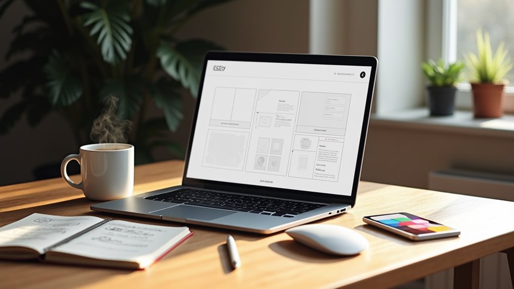
Web design doesn’t need to feel overwhelming. Your website’s success depends on key building blocks: a clear header, intuitive navigation, engaging content blocks, and a functional footer. You’ll need essential components like your home page, about section, and contact information structured with user-friendly design principles. Modern websites must prioritize mobile responsiveness, as over 58% of web traffic comes from smartphones and tablets. Focus on creating visual hierarchies that guide visitors, implementing proper SEO practices, and ensuring accessibility across all devices. Understanding these fundamental elements will help you make informed decisions about your online presence.
Web Design Building Blocks
At the foundation of modern web design lie essential building blocks that form the structural framework of any successful website. When you’re developing your business website, you’ll encounter key components like header design, which houses your branding and main navigation, and strategically placed call to action design elements that drive user engagement.
Content block usability plays an important role in organizing your information effectively, while footer functionality provides essential secondary navigation and contact details. Modern enterprises benefit from reusable blocks that streamline website updates and maintenance. A well-designed website requires reliable hosting to ensure consistent performance and uptime. You’ll need to focus on layout optimization to guarantee your site’s structure supports both user experience and business objectives.
Card design elements help present your products or services in digestible formats, and dropdown menus keep your interface clean while maintaining access to additional information.
Navigation bar effectiveness directly impacts how visitors interact with your site, making it essential to implement clear, intuitive pathways. Modern websites demand responsive layouts that adapt seamlessly across all devices, from desktop to mobile.
Additionally, you’ll need to incorporate accessibility features to guarantee your site serves all users effectively, regardless of their abilities or browsing methods. These components work together to create a cohesive, professional online presence that represents your business effectively.
Essential Website Components
Understanding your website’s core components helps you make informed decisions during the development process. Your site needs several fundamental elements to function effectively and serve your visitors’ needs.
Every business website requires specific pages: a home page to welcome visitors, an about page to tell your story, and a contact page for accessibility. You’ll also need a robust header containing your logo and main navigation, plus a footer that houses important links and legal information. A well-organized sidebar can provide additional navigation options and promotional space without cluttering the main content area.
Landing pages serve as powerful tools for specific marketing campaigns or product launches. Incorporating a content slider can effectively showcase multiple promotions or key content pieces.
Your site’s functionality depends on essential plugins and technical elements. These include security features like SSL certificates to protect data, analytics tools to track performance, and responsive design elements that guarantee your site works perfectly across all devices.
Website accessibility features are vital, making your content available to all users regardless of their abilities.
The user experience hinges on clear navigation systems, including menus and breadcrumbs, while prominent calls-to-action guide visitors toward your business goals.
Making Your Site User-Friendly

User-friendly website design forms the foundation of successful online engagement. To enhance your site’s user experience, you’ll need to focus on clear navigation, intuitive design, and accessible content that works across all devices.
Start by implementing a logical menu structure with descriptive labels and a prominent search bar. Don’t overwhelm visitors with too many options; instead, maintain a clean, organized layout that guides them naturally through your content. Add breadcrumbs to help users track their location within your site’s hierarchy. Card sorting exercises can reveal how users expect content to be organized. With 88% of users unlikely to return after a poor experience, maintaining user-friendly design is crucial for business success. Additionally, consider utilizing project management tools to streamline your web design process and improve team collaboration.
Your design should adapt seamlessly to different screen sizes through responsive layouts and touch-friendly elements. Make certain your forms are easy to complete on both desktop and mobile devices, and optimize all media content to load efficiently across platforms.
Establish a clear visual hierarchy that prioritizes important information and maintains consistent design elements throughout. Regular usability testing across devices will help you identify and fix potential issues. Track user behavior, gather feedback, and make continuous improvements to enhance performance.
Remember to optimize your content for both users and search engines by implementing relevant keywords and compressed images.
Search Engine Success Fundamentals
Successful search engine optimization demands a strategic blend of technical expertise and content finesse. Your site’s visibility in search results depends on how well you implement proven SEO techniques while maintaining an engaging user experience. Technical SEO ensures your website architecture and performance meet search engine requirements. Building quality backlinks from authoritative websites will significantly boost your site’s credibility and search rankings.
Developing a solid keyword strategy begins with understanding what your target audience is searching for. You’ll need to research and integrate both high-traffic terms and specific long-tail keywords that match user intent. Remember to place these keywords naturally throughout your content to avoid triggering search engine penalties.
- Focus on crafting unique title tags and meta descriptions that encourage click-throughs while staying within character limits.
- Structure your content with clear header tags and maintain clean, descriptive URLs.
- Create high-quality, original content that demonstrates expertise and authoritativeness.
- Track performance metrics regularly using tools like Google Analytics to refine your approach.
Website Design Best Practices
Your website’s success starts with a mobile-first design approach, ensuring your content displays perfectly on smartphones and tablets where most of your visitors now browse.
Visual hierarchy guides your visitors’ attention through strategic use of font sizes, weights, and spacing, making your content instantly scannable and digestible. Users make 50-millisecond judgments about your website’s appeal when they first land on your pages. CSS plays a vital role in creating responsive layouts that deliver consistent styling across all devices.
You’ll want to implement simplified navigation elements like clear menus and thumb-friendly buttons to help users move effortlessly through your site’s content.
Mobile-First Design Approach
Modern businesses face intense competition in the mobile-driven digital landscape, making a mobile-first design approach essential for website success. This strategy prioritizes mobile user experience by focusing on design principles that enhance content delivery, navigation, and overall performance on smaller screens.
To create an effective mobile-first website, you’ll need to implement these key elements:
- Prioritize essential content by displaying critical information prominently and organizing elements according to their importance, guaranteeing a clear visual hierarchy.
- Implement intuitive navigation using hamburger menus for secondary elements, descriptive labels, and bold calls-to-action that guide users effectively.
- Maintain a minimalist design approach by using clean typography, adequate font sizes, and avoiding cluttered layouts or distracting elements like pop-ups.
- Optimize performance through regular testing on real devices, compressing files, and minimizing code to guarantee fast loading times.
Remember to continuously analyze user behavior and identify pain points to refine your mobile design.
Your website’s success depends on delivering a seamless experience across all devices, with mobile taking precedence in development and testing phases.
Visual Hierarchy Matters Most
A well-crafted visual hierarchy serves as the backbone of effective website design, guiding visitors’ attention and making complex information instantly digestible.
By implementing key design principles, you’ll create a structure that naturally leads users through your content while emphasizing what matters most.
Size and scale play vital roles in your visual hierarchy. You’ll want to use larger elements for primary content and maintain consistent heading sizes throughout your site.
When you’re establishing contrast, choose colors that clearly distinguish between different elements – this helps users navigate your content effortlessly and understand relationships between various components.
Your layout’s success depends heavily on proper alignment and proximity. You’ll find that grouping related elements together while maintaining appropriate spacing creates a natural flow that users can easily follow.
Remember to use a grid system to guarantee everything stays properly aligned and organized.
Before implementing these design principles, you’ll need to define your website’s objectives clearly.
Your visual hierarchy should directly support your business goals by guiding visitors toward specific actions while maintaining an engaging user experience that keeps them on your site longer.
Simplified Navigation Elements
Building on strong visual hierarchy fundamentals, effective website navigation demands careful attention to simplification and user-centric design. Your site’s navigation usability directly impacts how visitors interact with your content and ultimately convert into customers. Through strategic menu organization and clear labelling, you’ll create an intuitive path for users to find what they need quickly.
- Start with a logical menu structure, using descriptive yet concise titles that guide visitors naturally through your site’s hierarchy. You’ll want consistent primary navigation items that link to well-organized landing pages.
- Design your navigation to work seamlessly across all devices – from desktop computers to mobile phones. This means implementing responsive layouts and ensuring adequate spacing between clickable elements.
- Incorporate visual cues like breadcrumbs and active state indicators to help users understand their location within your site’s structure. Consider adding a prominent call-to-action button in your top navigation.
- Keep your navigation structure flat, allowing visitors to reach any page within one to two clicks. For larger sites, implement a search function and consider using mega menus to organize complex content hierarchies effectively.
Mobile and Responsive Design
Two critical aspects of today’s web design are mobile compatibility and responsive design. Your website must adapt seamlessly to different screen sizes, from desktop monitors to smartphones. This mobile adaptability guarantees your visitors can access and navigate your content effortlessly, regardless of their device choice.
Modern websites use fluid layouts that automatically resize elements based on screen dimensions. When someone views your site on their phone, the content adjusts proportionally, maintaining readability and functionality. You’ll notice images scale properly, buttons remain clickable, and text stays legible without horizontal scrolling.
To achieve this responsiveness, your web designer will implement specific technical features like CSS media queries and flexible media containers. They’ll also define viewports that tell browsers how to display your content on different devices.
It’s worth noting that over 58% of web traffic now comes from mobile devices, making responsive design not just a technical choice but a business necessity.
Content Structure and Navigation

Strong website architecture forms the foundation of user experience, much like mobile responsiveness shapes how visitors interact with your site. Understanding content hierarchy and implementing effective navigation strategies isn’t just about placing menus and buttons—it’s about creating an intuitive path for your visitors to find what they need.
Your website’s structure should follow these essential principles:
- Keep your navigation hierarchy flat and simple, guaranteeing visitors can reach any page within 2-3 clicks. This prevents users from getting lost in deep, complex menu structures.
- Use clear, consistent labels throughout your site’s navigation. Avoid jargon and stick to simple terms that your target audience will understand immediately.
- Implement a balanced approach combining global navigation (main menu) with contextual navigation that changes based on the user’s location within your site.
- Organize your content using a logical taxonomy system, grouping related information together in a way that makes sense to your visitors.
Remember that effective content structure isn’t about cramming everything into view—it’s about creating a clear path that guides visitors naturally through your site’s information.
Regular testing with actual users helps refine your navigation approach and guarantees it serves your business goals effectively.
Frequently Asked Questions
How Much Does Professional Web Design Typically Cost for Small UK Businesses?
You’ll find professional web design costs vary based on budget considerations and pricing models. For your small UK business, expect to pay £500-£3,000 for a brochure site or £5,000-£15,000 for custom solutions.
How Long Does It Usually Take to Build a Complete Business Website?
You’ll typically need 3-6 months for complete website development timeline, though it can vary based on your project’s complexity. Good project management tips include setting clear milestones and maintaining active communication with developers.
Can I Update My Website Content Myself After It’s Built?
Yes, you can update your website content yourself using a content management system. With proper training, you’ll handle basic website maintenance like changing text, images, and contact details without needing technical expertise.
Should I Choose WordPress or a Website Builder for My Business Site?
Choose WordPress if you need extensive customization and scalability for complex features. Pick a website builder if you want an easier, all-in-one solution with quick setup and basic functionality for your business site.
How Often Should I Redesign or Update My Business Website?
You’ll want to refresh your website every 2-3 years to stay current with design trends. Update content regularly and monitor performance metrics, making smaller improvements between major redesigns to maintain your site’s effectiveness.
Final Thoughts
You’re now equipped with the essential web design vocabulary and concepts to make informed decisions about your business website. Understanding these fundamentals will help you communicate effectively with designers, evaluate proposals, and maintain quality oversight of your site. Whether you’re launching a new website or upgrading an existing one, you’ll be able to focus on what truly matters: creating an effective online presence that drives business results.

