
You’ll find Stockport’s web design scene embracing minimalist aesthetics with clean lines and strategic white space, while mobile-first strategies dominate since over 60% of traffic comes from mobile devices. Local businesses are integrating AI-powered personalization features that analyze user behavior for customized experiences, alongside bold typography reflecting the town’s industrial heritage through copper tones and vintage fonts. Sustainable coding practices and interactive elements are also transforming how visitors connect with local brands, and exploring these trends further reveals their powerful impact.
Minimalist Design Approaches Taking Center Stage in Stockport

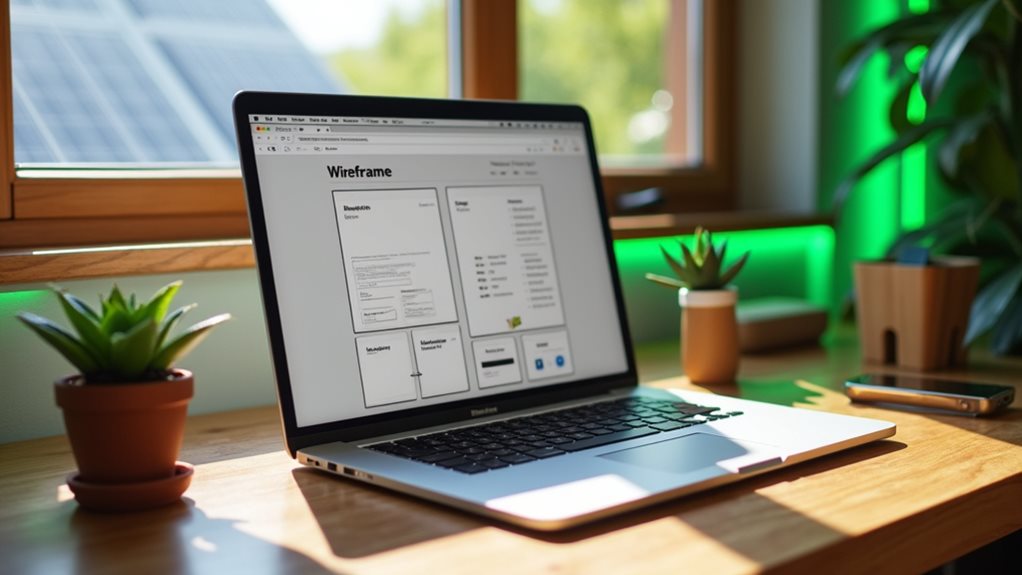
While web design trends shift constantly across the digital environment, Stockport’s creative community has welcomed minimalist approaches that prioritize clean lines, generous white space, and purposeful simplicity.
Stockport’s design community champions minimalist aesthetics, embracing clean lines and intentional white space over cluttered digital landscapes.
You’ll notice local businesses are embracing designs that strip away unnecessary elements, focusing instead on what truly matters to their users. This approach isn’t just about aesthetics—it’s about creating clear visual hierarchy that guides visitors through your content effortlessly.
When you’re implementing minimalist design, you’ll want to carefully consider your color palettes.
Stockport designers are gravitating toward neutral tones with strategic accent colors that draw attention to key elements. This restrained approach helps your message shine through without distractions.
You’ll find that less truly becomes more when every element serves a specific purpose in your user’s experience.
Mobile-First Strategies Driving Local Business Success
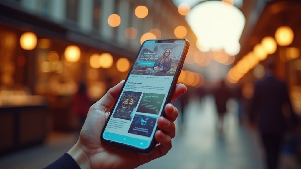
You’ll find that mobile-first strategies aren’t just trendy buzzwords—they’re crucial for capturing your local customer base who’s increasingly browsing on smartphones.
When you implement responsive design properly, your website automatically adapts to any screen size, guaranteeing potential customers won’t abandon your site due to poor mobile experience.
Smart local SEO optimization combined with mobile-friendly design creates a powerful combination that helps your business appear prominently in “near me” searches, directly connecting you with customers ready to make purchasing decisions.
Responsive Design Implementation
Since mobile devices now account for over 60% of web traffic, implementing responsive design isn’t merely a trend—it’s become essential for local businesses looking to capture and retain customers.
You’ll need to prioritize user-centered design principles that adapt seamlessly across all screen sizes, guaranteeing your content flows naturally from desktop to tablet to smartphone.
Focus on flexible grid systems, scalable images, and touch-friendly navigation elements.
Don’t overlook accessibility features like proper contrast ratios, readable font sizes, and keyboard navigation support—these elements improve usability for all visitors while boosting your search rankings.
Test your design on multiple devices regularly, paying attention to loading speeds and interactive elements.
You’re not solely creating a website; you’re crafting an experience that works everywhere your customers are.
Local SEO Optimization
When customers search for “pizza near me” or “plumber in Stockport,” your business’s visibility depends entirely on how well you’ve optimized for local search algorithms that prioritize mobile-first indexing.
You’ll need to focus on building consistent local citations across directories like Google My Business, Yelp, and industry-specific platforms. Your NAP information—name, address, phone number—must match exactly across all listings.
Thorough keyword research becomes essential for targeting location-specific terms your Stockport customers actually use. You can’t just guess what phrases they’re typing; you need data-driven insights.
Mobile users often search differently than desktop users, using voice commands and conversational queries. Your website’s local optimization strategy should account for these behavioral shifts, guaranteeing you’re capturing traffic from customers who are ready to buy right now.
Sustainable Web Design Practices Gaining Momentum
You’re witnessing a notable shift toward sustainable web design practices as environmental consciousness reaches the digital domain.
Energy-efficient coding methods now help you reduce server loads while green hosting solutions minimize your website’s carbon footprint through renewable energy sources.
Energy-Efficient Coding Methods
Although environmental consciousness has permeated nearly every industry, web development is finally catching up with coding practices that prioritize energy efficiency alongside functionality.
You’re now seeing developers adopt sustainable coding methods that reduce server loads and minimize resource consumption. These practices aren’t just environmentally responsible—they’ll improve your site’s performance and reduce hosting costs.
Key energy-efficient coding approaches include:
- Optimizing database queries to reduce processing power
- Implementing lazy loading for images and content
- Minimizing JavaScript execution and DOM manipulation
You’ll find that energy efficient frameworks like Svelte and Alpine.js consume considerably less power than traditional options.
When you prioritize sustainable coding, you’re creating websites that load faster while consuming fewer server resources, making your digital presence both eco-friendly and cost-effective.
Green Hosting Solutions
While energy-efficient coding forms the foundation of sustainable web development, your choice of hosting provider can make an even greater environmental impact.
Traditional data centers consume massive amounts of electricity, but you can greatly reduce your website’s carbon footprint by selecting providers committed to renewable energy sources.
Look for hosting companies that display green certifications from recognized environmental organizations. These certifications verify that providers use solar, wind, or hydroelectric power to run their servers.
Many leading hosts now purchase renewable energy credits or operate carbon-neutral facilities as part of their eco friendly practices.
You’ll find that sustainable hosting options often cost the same as traditional services, making this an easy switch that benefits both your conscience and your website’s environmental credentials.
Minimal Resource Usage
Beyond choosing eco-friendly hosting, minimalist design principles can dramatically reduce your website’s environmental impact while improving user experience.
You’ll find that streamlined designs not merely load faster but also consume less energy across all devices. User centered design naturally leads to cleaner interfaces that prioritize crucial content.
When you eliminate unnecessary elements, you’re creating an efficient workflow that benefits both visitors and the environment. Consider these resource-saving strategies:
- Optimize images through compression and modern formats like WebP
- Minimize HTTP requests by combining CSS and JavaScript files
- Remove unused plugins and code that bloat your site
This approach transforms your website into a lean, purposeful platform.
You’re not only following trends; you’re contributing to a more sustainable digital ecosystem while delivering exceptional user experiences that convert visitors effectively.
AI-Powered Personalization Features Transforming User Experience
How can websites predict exactly what you want before you even know it yourself? AI-powered personalization is revolutionizing web design by analyzing user behavior patterns to create customized experiences.
Modern websites track your clicks, scrolling habits, and time spent on pages to build extensive profiles. These sophisticated personalization algorithms then adapt content, product recommendations, and interface elements in real-time.
You’ll notice websites now remember your preferences across visits, suggesting relevant articles or products based on your browsing history. Dynamic content blocks shift based on your interests, while smart navigation menus highlight sections you’re most likely to explore.
This technology creates seamless, intuitive experiences that feel almost telepathic. For Stockport businesses, implementing AI personalization can greatly boost engagement rates, conversion metrics, and customer satisfaction by delivering precisely what visitors seek.
Bold Typography Trends Reflecting Stockport’s Character
Typography isn’t just about making words readable anymore—it’s become a powerful tool for expressing local identity and cultural connection in web design.
You’ll notice Stockport-based websites increasingly adopt bold color palettes that mirror the town’s industrial heritage while incorporating vintage typography that nods to its rich textile history.
These design choices aren’t accidental—they’re strategic decisions that help local businesses stand out:
- Industrial-inspired fonts that echo Stockport’s manufacturing past
- Warm copper and brick tones reflecting the area’s architectural character
- Hand-drawn letterforms that add personality and local authenticity
You can implement these trends by selecting typefaces that tell your brand’s story while maintaining readability across devices.
Bold typography works best when it complements your content rather than overwhelming it, creating memorable user experiences that resonate with local audiences.
Advanced Interactive Elements Enhancing Customer Engagement

As customer expectations continue to evolve, interactive elements have become essential tools for creating meaningful connections between businesses and their online visitors.
You’ll find that modern websites now feature dynamic components that respond to user actions, creating personalized experiences that keep visitors engaged longer. Interactive storytelling transforms traditional content into immersive narratives, allowing you to guide customers through your brand experience while maintaining their attention.
Gamified experiences are revolutionizing how businesses connect with their audience. You can implement progress bars, achievement badges, and interactive quizzes that encourage participation.
These elements tap into users’ natural desire for completion and reward, making your website memorable. Hover effects, animated shifts, and micro-interactions provide immediate feedback, creating a responsive environment that feels alive and engaging rather than static.
Frequently Asked Questions
How Much Does Implementing Current Web Design Trends Cost for Stockport Businesses?
You’ll find budget considerations vary widely, from £500-£5000+ depending on complexity. However, investing in modern design trends delivers substantial design value through improved user experience, higher conversions, and increased brand credibility for your business.
Which Stockport Web Design Agencies Specialize in These Modern Trends?
You’ll find several local agencies showcasing modern techniques in their agency portfolios. Look for firms highlighting responsive design, minimalist layouts, and interactive elements. Review their recent work to assess which specialists align with your specific design vision and requirements.
How Long Does It Take to Redesign a Website With Current Trends?
Your website redesign timeline typically spans 4-12 weeks, depending on complexity and scope. You’ll need effective project management strategies to coordinate content creation, design reviews, and testing phases while guaranteeing you’re meeting deadlines efficiently.
Do These Web Design Trends Work for All Types of Stockport Businesses?
You’ll find design trend adaptability varies considerably across industries. Business type compatibility matters—minimalist designs suit professional services, while vibrant aesthetics work better for creative agencies. You should evaluate each trend’s relevance to your specific audience and goals.
What Happens to SEO Rankings When Updating to New Design Trends?
You’ll face SEO implications when redesigning, but don’t panic about ranking fluctuations. If you maintain proper URL structure, optimize loading speeds, and preserve quality content, you’ll typically recover and improve rankings within weeks.
Final Thoughts
You’re witnessing Stockport’s web design evolution firsthand, where minimalist aesthetics meet cutting-edge functionality. These trends aren’t just fleeting fashion—they’re strategic shifts that’ll directly impact your business success. Whether you’re embracing mobile-first approaches, implementing AI personalization, or adopting sustainable practices, you’re positioning yourself ahead of competitors. Don’t wait to integrate these elements into your digital presence. Your customers expect modern, engaging experiences, and Stockport’s design environment is delivering exactly that transformation.

Business Consultant at iindigo
I help business owners build their online brand to help attract more clients and grow their business.
Latest posts by Mark Draper (see all)
- How to Track and Improve Website Conversion Rates - 14/01/2026
- Best Practices for Call-to-Action Buttons - 09/01/2026
- The Psychology of Colours in Web Design - 04/01/2026