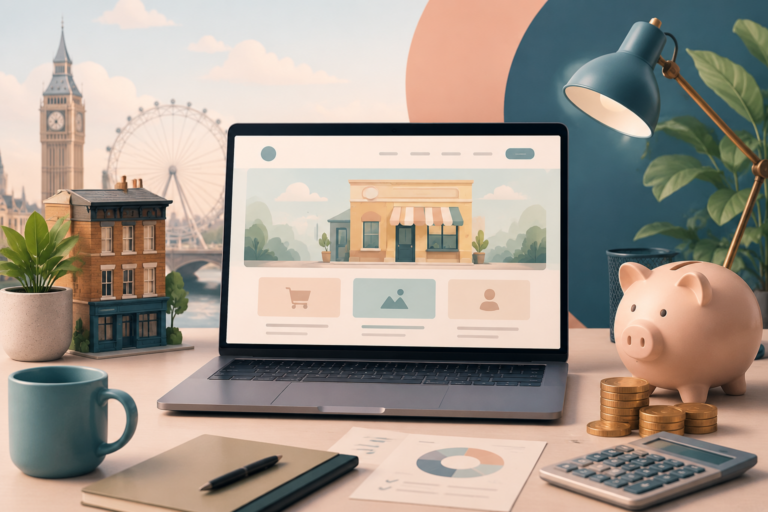
Effective UX design boosts website conversions by reducing friction points and guiding users through intuitive pathways. You’ll convert more visitors when you strategically place CTAs with proper visual hierarchy, optimize forms by minimizing fields, and guarantee mobile responsiveness. Fast load speeds are essential—each additional second can cost you 7% in conversions. By analyzing user behavior data and addressing psychological barriers like uncertainty, you’ll create experiences that transform hesitant visitors into committed customers. The case studies below reveal the dramatic impact of thoughtful redesigns.
The Psychology Behind High-Converting UX Design

Developing user empathy helps you anticipate pain points along the user path, allowing you to create intuitive pathways that reduce decision fatigue. Notice how the most successful websites guide visitors naturally toward conversion points? That’s persuasive design at work. Your users make thousands of micro-decisions while exploring your site. Each interaction either builds confidence or creates friction. By understanding these psychological triggers, you’ll design experiences that feel effortless while strategically nudging users toward desired actions—without them even realizing they’re being directed. Incorporating SEO best practices into your UX design further enhances site visibility, drawing in more visitors who are likely to convert.
Strategic Placement of Call-to-Action Elements
Strategic placement of your call-to-action buttons can dramatically increase conversion rates when you implement proper visual hierarchy techniques.
You’ll see better results by identifying and eliminating friction points that might prevent users from completing desired actions on your website.
The strategic use of color psychology—particularly contrasting colors for CTAs against your site’s background—will naturally draw your visitors’ attention to the exact spots where you want them to take action. Additionally, incorporating effective landing page design can further enhance user engagement and conversion potential.
Visual Hierarchy Techniques
The art of visual hierarchy transforms ordinary websites into conversion machines by guiding users’ eyes exactly where you want them to go.
When you strategically employ visual cues like size contrast, color variation, and white space, you’re fundamentally creating a roadmap for your visitors to follow toward conversion points.
Your typography choices play a vital role in this hierarchy—larger, bolder fonts naturally draw attention first, while secondary information can use smaller, lighter styles.
Don’t underestimate how these subtle differences influence user behavior.
Remember that effective visual hierarchy isn’t about randomness; it’s about intentional design decisions that align with your conversion goals. Additionally, integrating well-designed landing pages in Gatley can further enhance user engagement and conversion rates.
Reducing Friction Points
When users encounter obstacles in their path toward conversion, they’re likely to abandon your site altogether, making friction reduction a crucial aspect of effective UX design. Your primary goal should be identifying and eliminating these barriers throughout user pathways.
Start by auditing your conversion funnel to pinpoint where users hesitate or drop off. Common friction points include complicated forms, unclear navigation, and slow loading times. Simplify these elements mercilessly—reduce form fields to only what’s absolutely necessary, create intuitive navigation patterns, and optimize page speed.
Remember that friction isn’t always visible. Psychological barriers like uncertainty about next steps or security concerns can greatly impact conversion rates. Address these by implementing progress indicators, transparent pricing, and prominent security badges at checkout points where users typically experience decision anxiety. Effective landing page design can significantly aid in decreasing these friction points and improving user experiences.
Color Psychology Impact
Beyond eliminating friction points, effective UX design harnesses the power of color psychology to guide user behavior and increase conversions. Different colors trigger specific emotional responses in your visitors, creating subtle but powerful influences on their decision-making process.
Red creates urgency, while blue builds trust. You’ll want to align these color meanings with your brand identity and conversion goals. For example, using green for payment buttons can signal safety and permission to proceed, while orange often boosts enthusiasm for newsletter signups.
Don’t rely on intuition alone—test how different color combinations affect your specific audience. The most effective approach integrates strategic color choices with contrast principles to make important elements stand out. Implementing landing page design principles can further enhance the effectiveness of your color strategy.
Remember that cultural differences may influence how your users interpret colors, so consider your target demographic when making these critical design decisions.
Optimizing Form Design for Maximum Completion Rates
Forms represent critical conversion points where users either commit to your offering or abandon ship altogether. To maximize completion rates, you’ll need to scrutinize every aspect of your form design.
Start by evaluating your form length—shorter forms typically perform better, with conversion rates dropping by approximately 50% when forms exceed five input fields.
Form brevity drives success—exceed five fields and watch half your potential conversions vanish.
Consider each field’s necessity and eliminate those that aren’t absolutely vital. Structure your remaining input fields logically, grouping related information together and using clear, concise labels. You’ll see higher completion rates when you implement inline validation, showing users in real-time whether their entries are correct.
Remember to make error messages helpful rather than accusatory. Mobile optimization is non-negotiable—ensure your forms are responsive and thumb-friendly with appropriately sized touch targets.
Mobile Responsiveness and Its Impact on Conversion
Mobile responsiveness isn’t just about aesthetics—it’s a conversion powerhouse that demands your attention.
You’ll see dramatic improvements in engagement when you implement one-thumb navigation design, optimize load speeds to under three seconds, and simplify checkout flows specifically for smaller screens.
These mobile-focused refinements acknowledge how today’s consumers shop on-the-go, transforming frustrated abandonment into completed transactions that boost your bottom line.
One-Thumb Navigation Design
Nearly 70% of web traffic now comes from smartphones, where users typically maneuver with just one thumb.
Designing for this reality means creating interfaces that prioritize thumb friendly gestures and intuitive reachability.
You’ll want to position critical navigation elements within the natural arc of thumb movement—typically the lower half of the screen.
Consider implementing swipe functionality for common actions and guarantee touch targets are at least 44×44 pixels to prevent frustrating mis-taps.
Hamburger menus, while space-efficient, should be evaluated against the extra interaction they require.
When you test your designs, watch how users actually hold their devices.
You’ll notice varied grips depending on phone size and user habits.
Adapting your navigation to these real-world behaviors will greatly enhance engagement and, ultimately, your conversion rates.
Load Speed Optimization
While aesthetics and navigation matter immensely, your website’s load speed forms the foundation of effective user experience. Research consistently shows that users abandon sites that take more than three seconds to load, directly impacting your conversion rates.
For every additional second of load time, you can expect to lose approximately 7% of potential conversions.
To optimize website performance, compress your images without sacrificing quality, leverage browser caching, and minimize HTTP requests. Consider implementing a content delivery network (CDN) to serve assets from servers closer to your users.
Mobile users, especially, have little patience for sluggish sites.
Remember that load speed isn’t just a technical concern—it’s a competitive advantage. When you prioritize performance, you’re respecting your visitors’ time and greatly improving their likelihood to convert.
Simplified Checkout Flows
Just as optimizing load speed creates the first impression, the checkout experience determines whether that impression converts to revenue. When you eliminate checkout barriers, you’re actively building user trust and completing the conversion path you’ve worked so hard to initiate.
To streamline your checkout process:
- Reduce form fields to the absolute necessities—every additional field increases abandonment by approximately 10%.
- Implement guest checkout options that don’t force account creation, which can increase conversions by up to 45%.
- Display security badges prominently during the payment process to reassure customers their information is protected.
Remember that your checkout flow should feel like a natural conclusion to the shopping experience, not an obstacle course that tests your customers’ patience and determination.
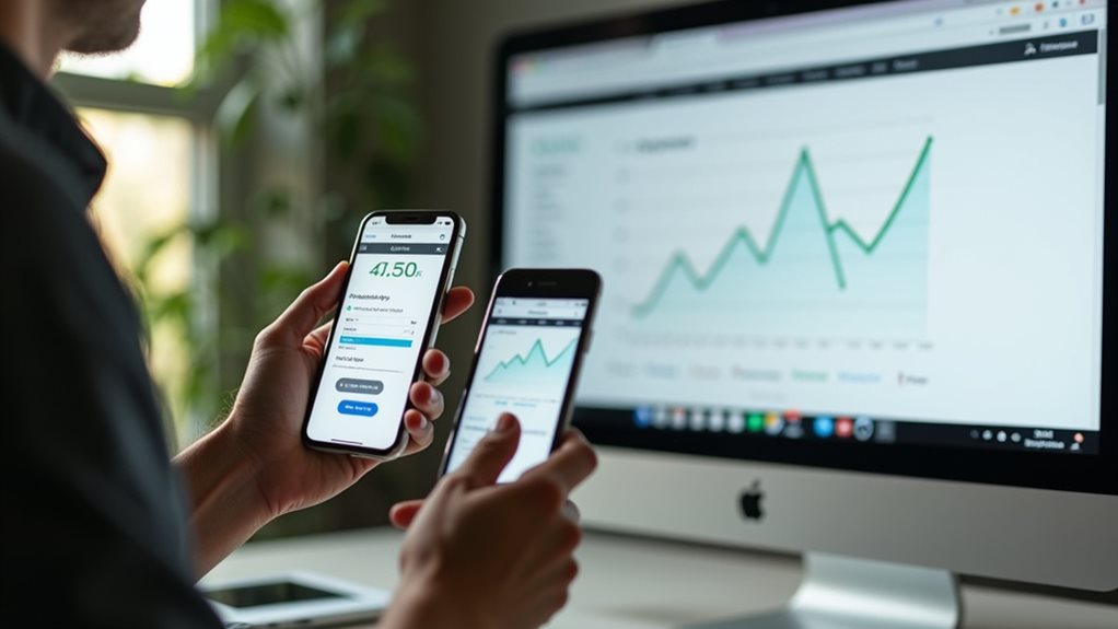
Using Data Analytics to Refine User Experience

Because meaningful UX improvements rely on evidence rather than assumptions, data analytics serves as your compass for website optimization. By tracking user behavior across your site, you’ll identify exactly where visitors struggle, abandon carts, or engage most deeply. This precision allows you to prioritize improvements with confidence rather than guesswork.
Effective data segmentation takes this further by helping you understand how different user groups interact with your site. You’ll discover that mobile users might traverse differently than desktop visitors, or that first-time visitors need different guidance than returning customers.
With these insights, you can tailor experiences to specific audience segments, creating pathways that feel intuitive to each user type. When you consistently analyze and respond to this data, your conversion rates will steadily climb as the experience becomes increasingly refined.
Case Studies: Before and After UX Redesigns
When businesses implement strategic UX redesigns, the results often speak volumes through measurable improvements in conversion metrics.
Consider these real-world transformations where companies leveraged thorough user research and competitor analysis to revitalize their digital presence:
- An e-commerce retailer increased checkout completions by 37% after simplifying their form fields and adding a progress indicator, directly addressing pain points identified through user testing.
- A SaaS platform saw 52% higher free trial conversions by redesigning their pricing page with clearer value propositions and simplified feature comparisons based on competitor analysis.
- A financial services website reduced bounce rates by 44% after restructuring navigation and implementing personalized content recommendations, informed by extensive user research sessions.
You’ll notice each success story combines data-driven insights with thoughtful design implementation—a powerful approach you can apply to your conversion challenges.
Final Thoughts
You’re now equipped with the tools to transform your website from a passive platform into a conversion powerhouse. Will you implement these UX strategies immediately, or watch your competitors capture the market share you’ve worked so hard to build? The choice is yours. Remember, great UX isn’t just about aesthetics—it’s about creating pathways that guide users naturally toward conversion while building trust in your brand.